UX/UI Design @ Ensightful • 2022
Redesigning the website to increase awareness of key product offerings
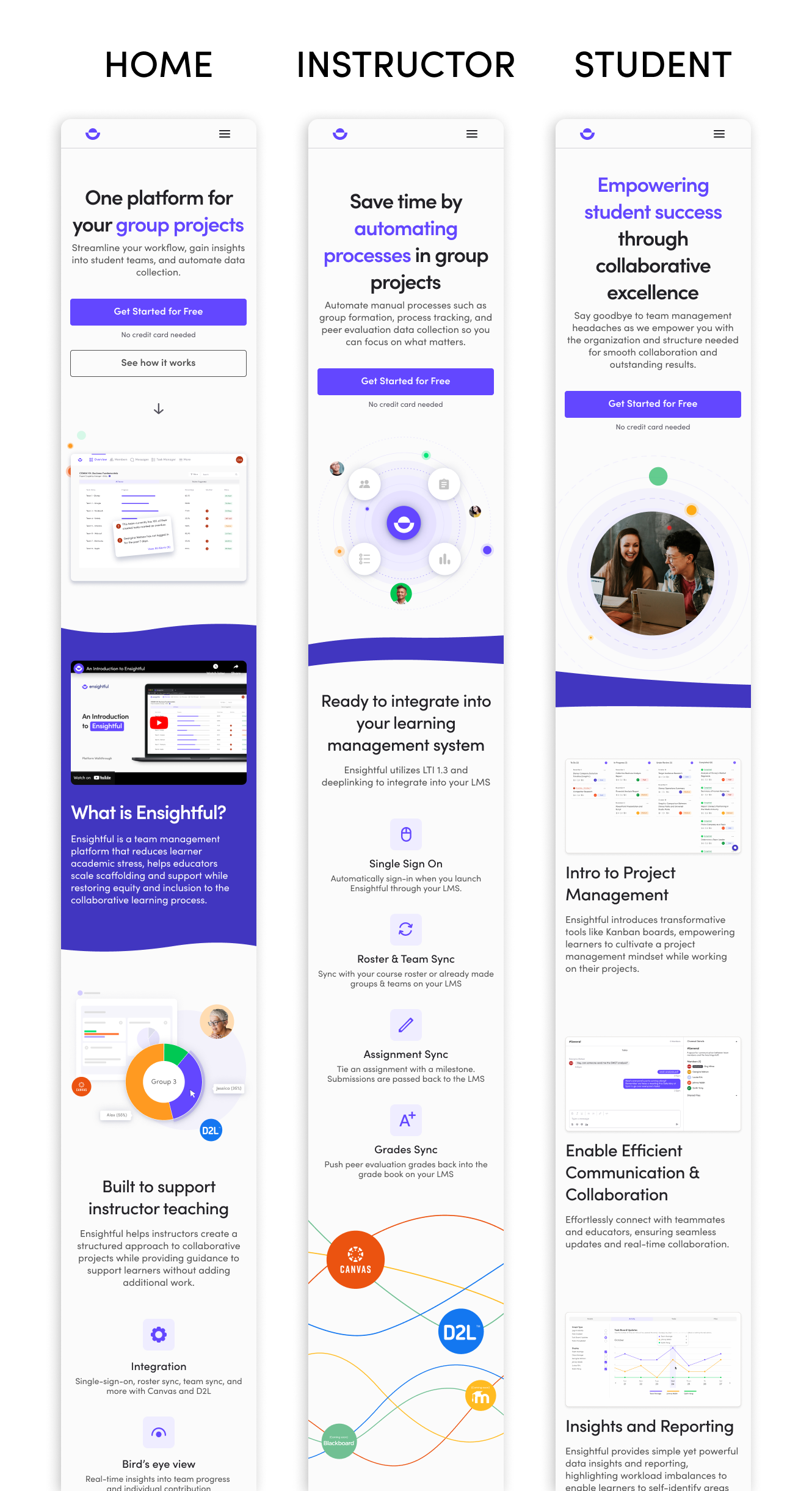
Ensightful is a team management platform in higher education that provides instructors with analytical insights into student teams. In conjunction, it is a project management tool for students to collaborate on their group projects.
In this 4-week project, I was responsible for onboarding the contract designer on Ensightful. I worked collaboratively with the contract designer to conduct user research, and during execution, I was responsible for creating wireframes and high-fidelity mockups.
“I don't see the features we talked about on the website. What does the working product actually offer?” - Seasonal Instructor from Arizona State University
Marketing at Ensightful is done primarily through LinkedIn and the website, with the website acting as the primary method to convert leads into pilots. However, the website lacked excitement and was outdated, creating confusion as to what the current product offerings are. As a result, this turned away potential clients as there was a discrepancy between the information presented in the demo call versus the website.
How might we communicate key information to educators to increase awareness of the full product offerings?
01
Clearly emphasize product offerings and value propositions on the home page
02
Information should be easily digestible and scannable
We conducted user interviews to understand the type of information decision makers (instructors & deans) look for when implementing a new tool in their institution and to learn about their perceptions about the current website. We also reached out to students to understand what they look for when learning a new tool.
These conversations helped us identify the following key insights:
01
Potential clients cannot find what they are looking for because the language is hard to understand.
02
Potential clients will leave if they cannot find what they are looking for
03
Demos are booked after reading up on product offerings.
04
Students are less likely to visit the website to find resources.
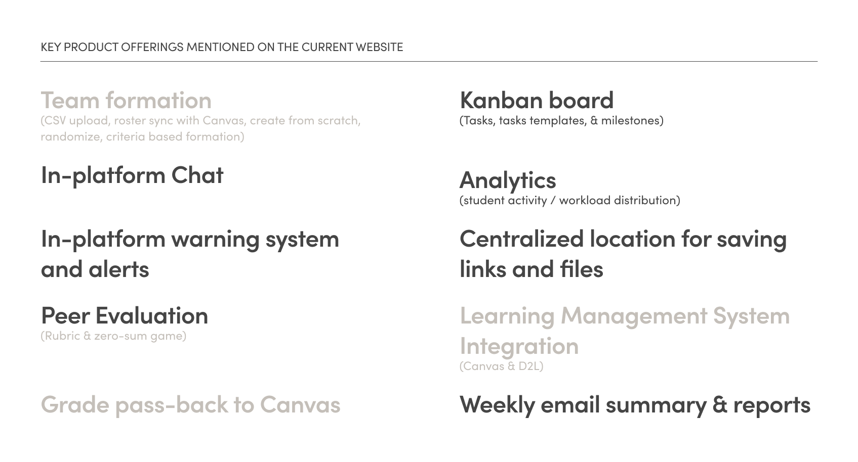
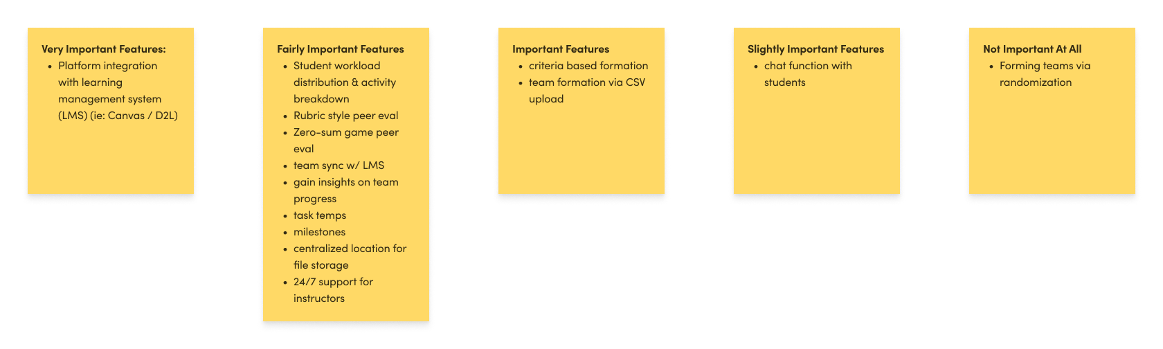
In our user interviews, we saw a common theme where decision makers looked at the cost and the product offerings to see how it can be implemented into their workflow. With that in mind, we conducted a moderated open card sort exercise, where 6 decision makers were asked to sort product offerings into various levels of importance. This helped us understand what features were important and to determine what features to emphasize on the website.
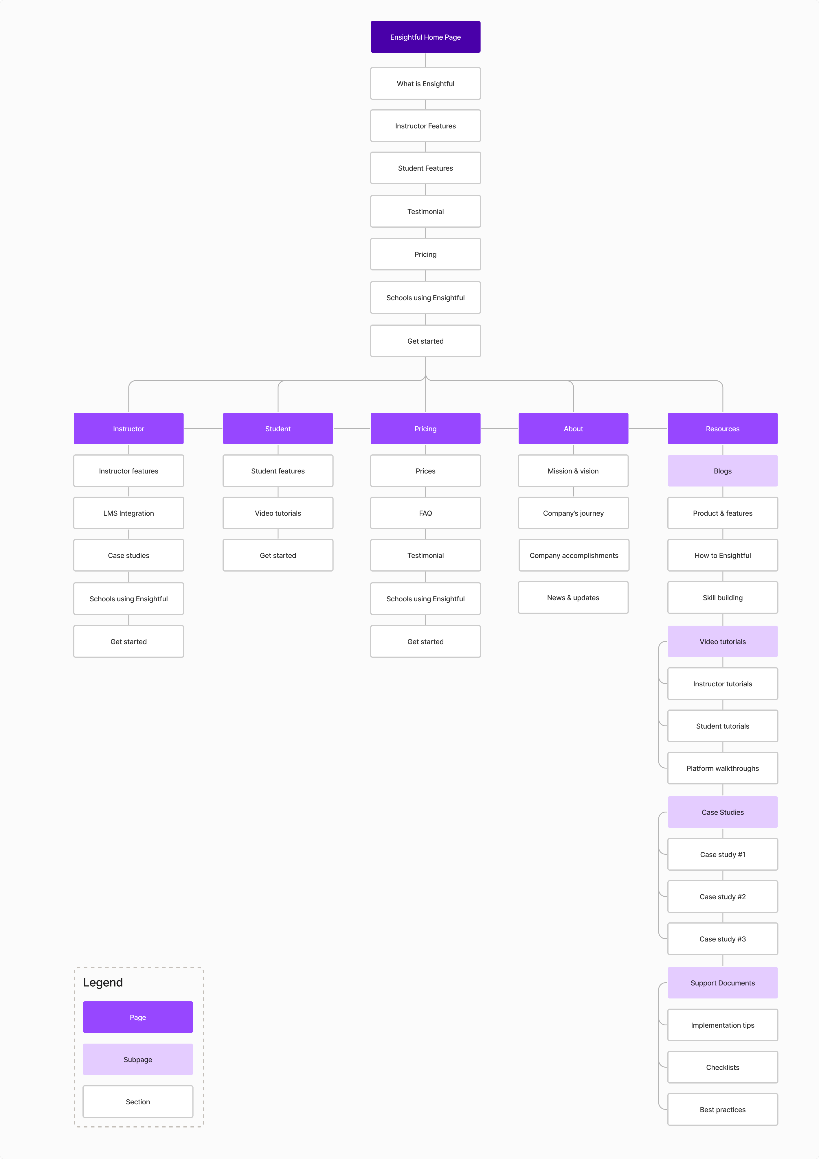
Another moderated card sort was conducted to determine how decision makers would organize content on a webpage. This allowed us to improve the organization and navigation of the website, ensuring that information is grouped in a way that is intuitive and meaningful to the users.
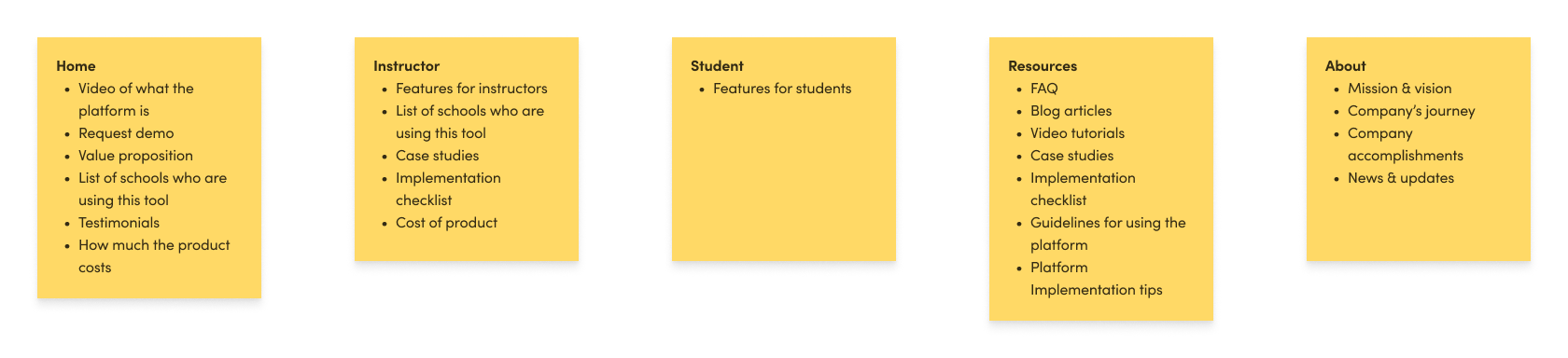
A tree test was used where decision makers were given tasks to find information in a simplified website structure. This allowed us to evaluate the information architecture of the website and identify how to display information to increase usability and navigation.
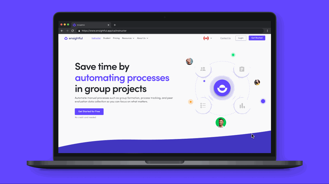
Approachable and friendly is conveyed through the use of geometric shapes. Multi-colors were used to create playfulness and boldness, while Ensightful’s brand color was used to highlight important information or sections.
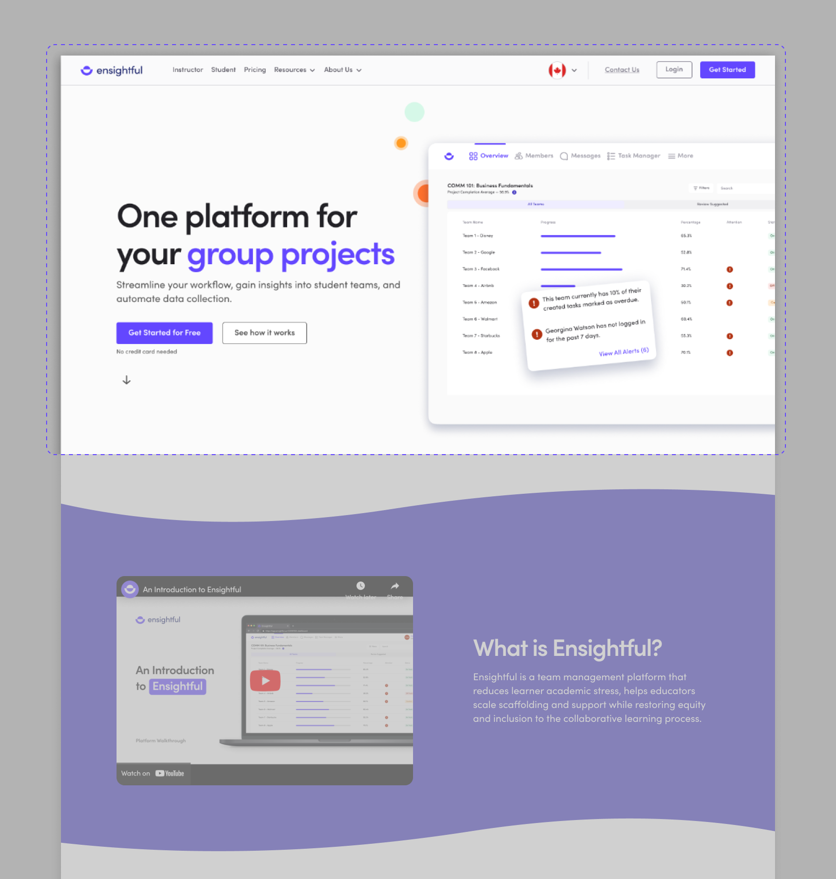
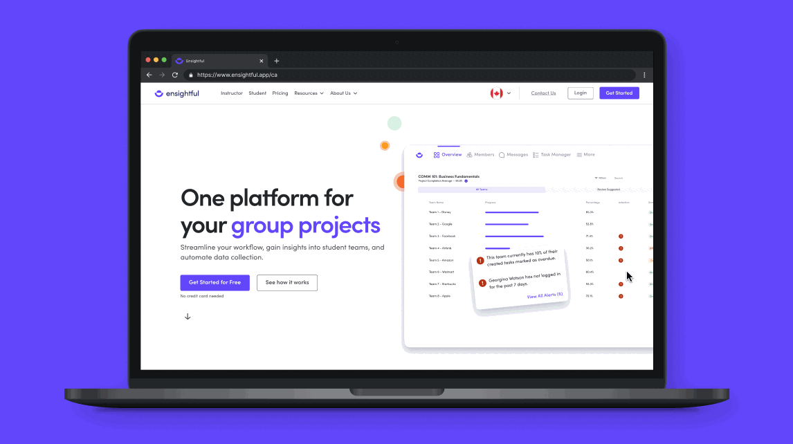
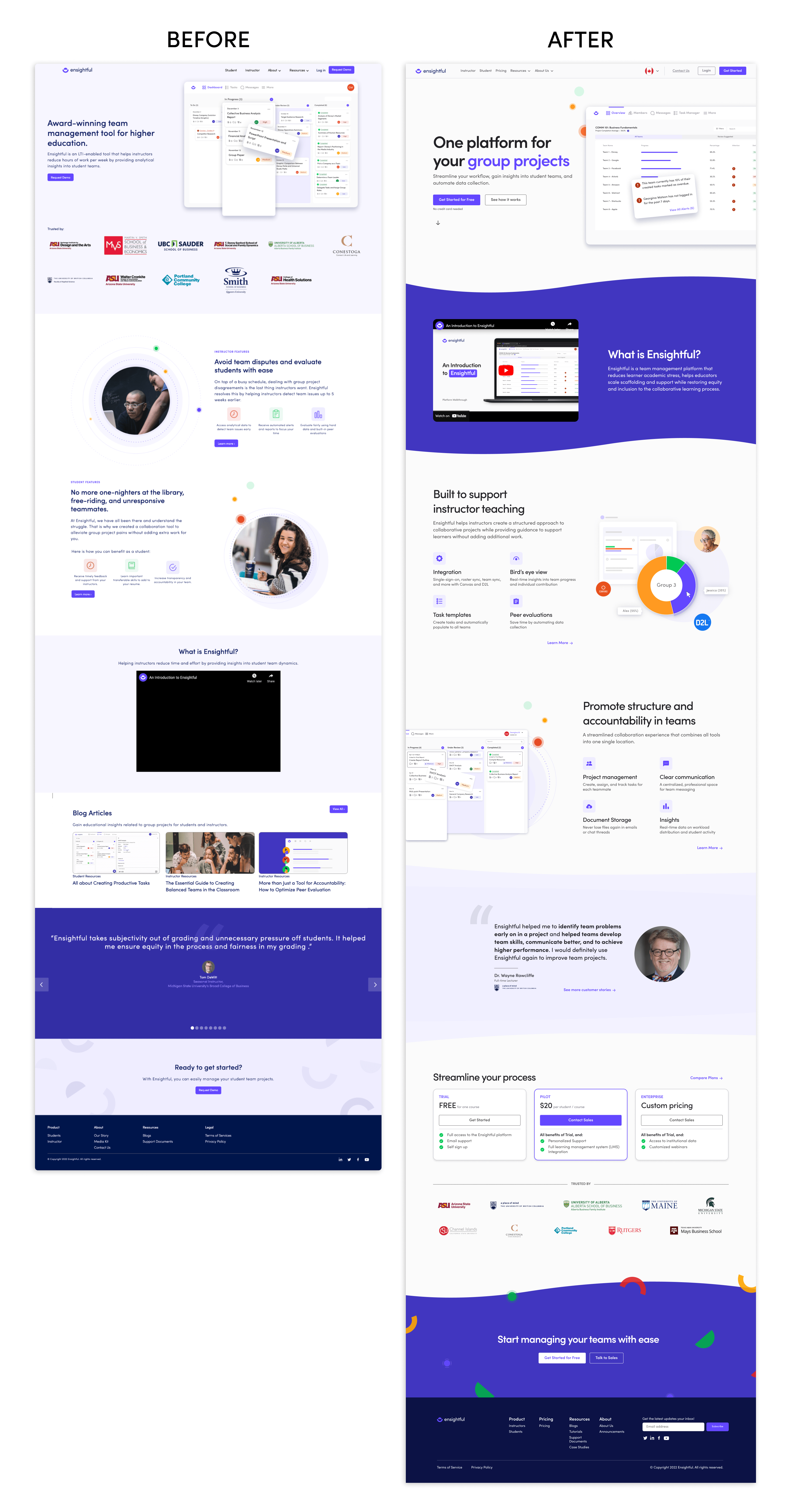
Upon landing on the home page, decision makers can see the value proposition that Ensightful offers and they have an option to explore the product hands-on, or continue through the website to see how it works.
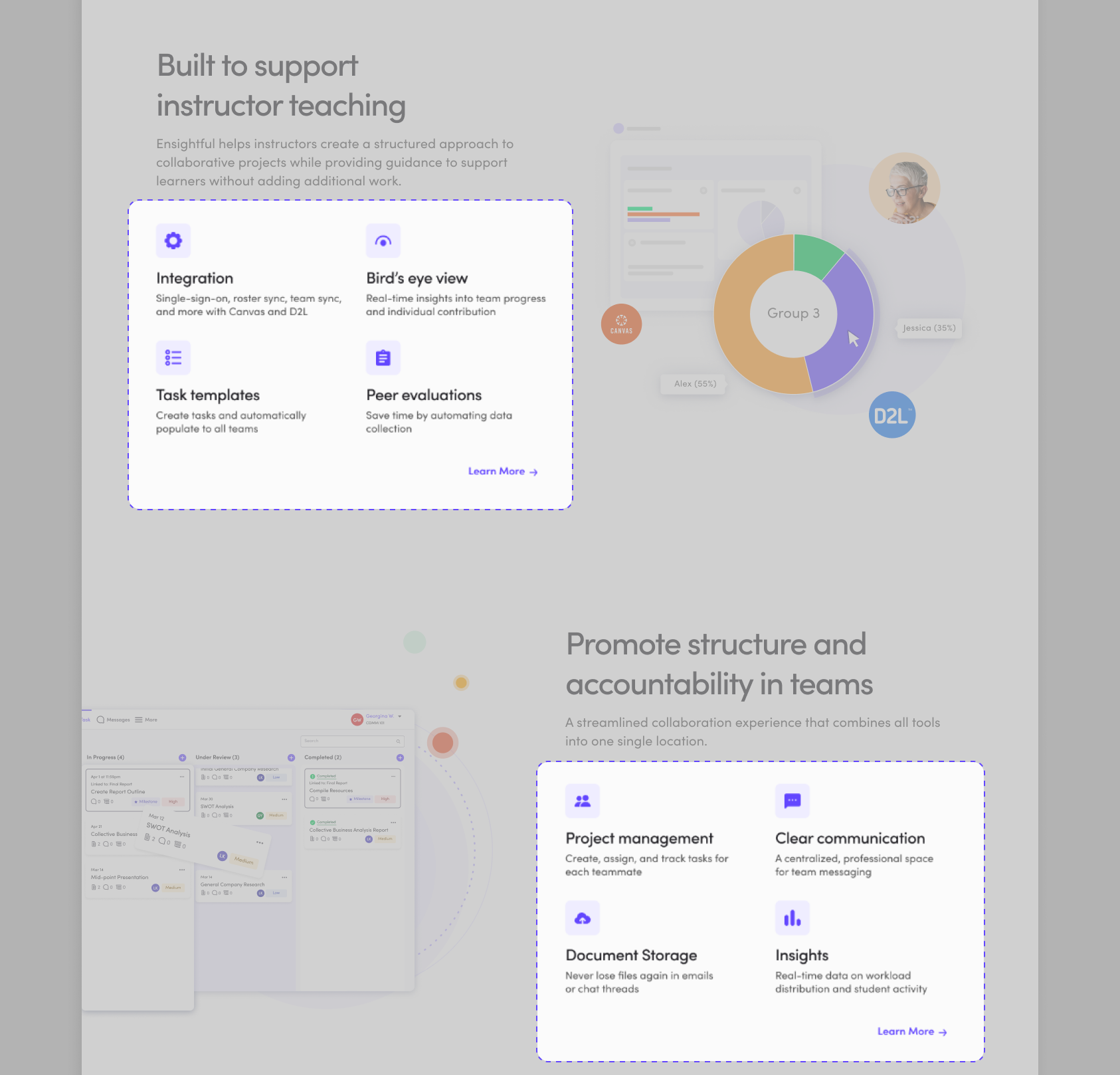
To make information more scannable, icons are used in conjunction with text to communicate core features that help instructors build structure and streamline project management in their courses.
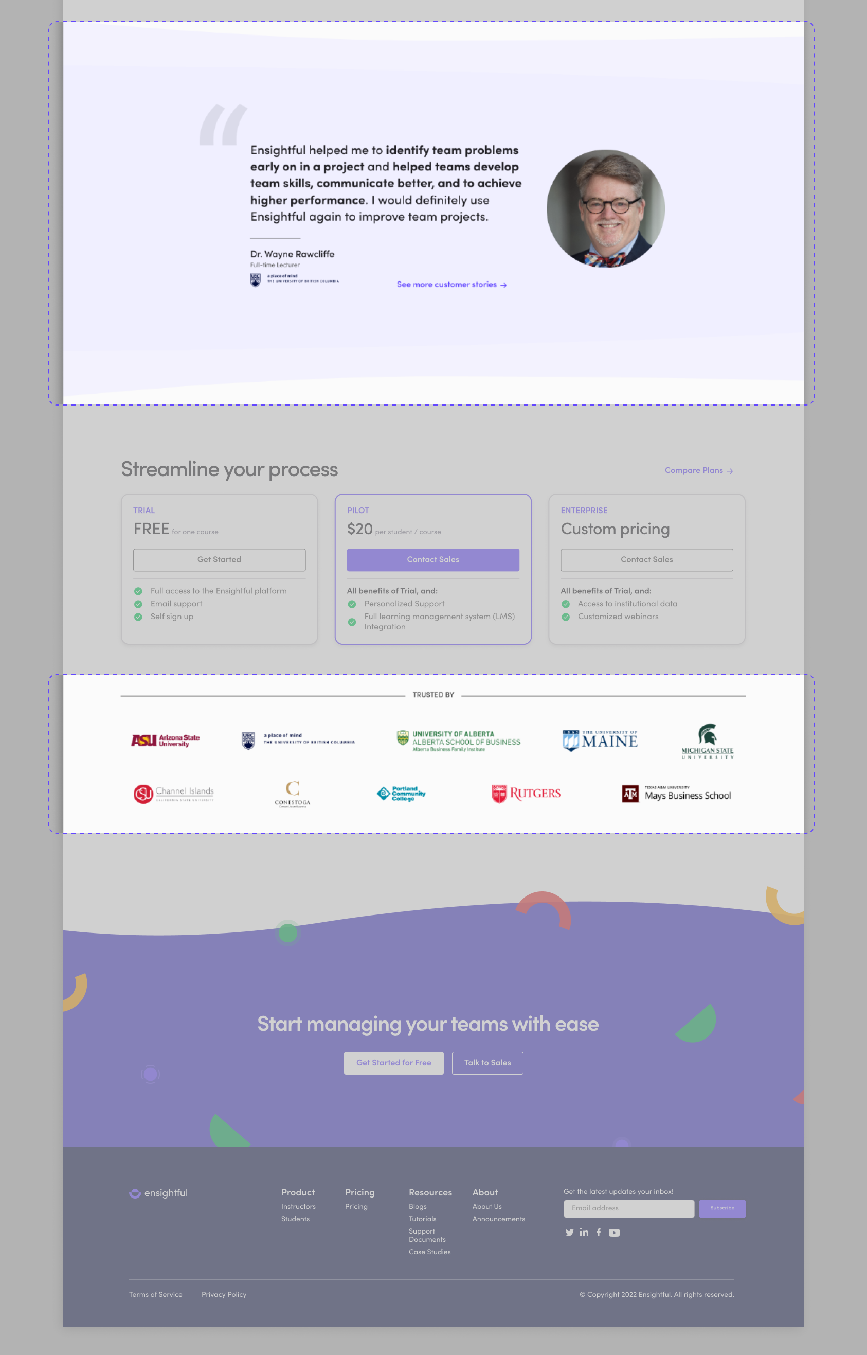
Testimonials and the list of schools using Ensightful is strategically placed near the pricing and call-to-actions to add credibility to the product.
The instructor page focuses on core offerings that Ensightful has that instructors can use in their project life cycle (forming teams, tracking progress, evaluating teams).
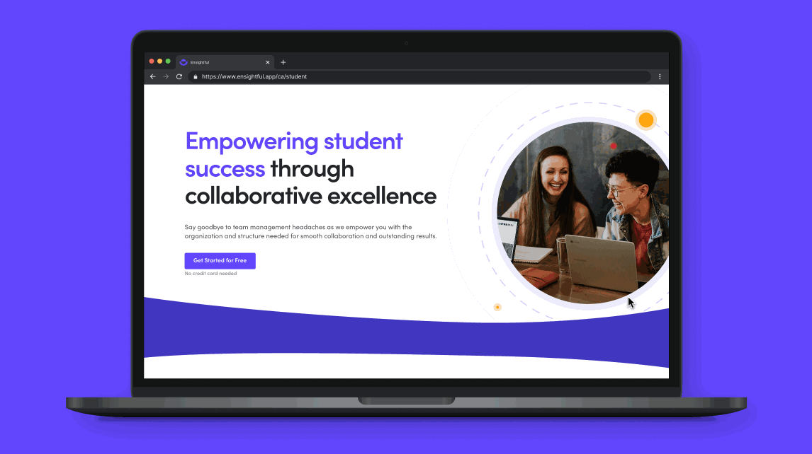
The student page highlights the skills and benefits that students can get out of using Ensightful. However, the content is tailored towards decision makers as we’ve found through our user interviews that students are less likely to visit a marketing website to learn more about the product.
This project taught me to involve users in organizing the content as it allows us as designers to leverage their perspectives and mental models to create a more intuitive and user friendly webpage.
In addition, while working on this project, I’m once again reminded it’s important to have an open-mind. During a user interview, we received feedback from an institutional instructor with a background in user experience that the research methods chosen for this project is inefficient. After the call, we stepped back to re-evaluate our project plan which allowed us to pick the right research methods to give us the data we need to drive this project forward. As research is the foundation for designing, the re-evaluation helped me build confidence in justifying decision decisions and become comfortable in pivoting to reach a better solution.