Trip Ninja • Design Systems 2026
Building a design system to bring consistency and scalability to a growing travel platform
Trip Ninja builds software for travel companies that helps streamline and improve the process of selling multi-stop trips.
As the UX/UI designer, I focused on building a scalable design system to help standardize the UI across platforms, reduce technical debt, and improve collaboration between design and engineering. My work focused on simplifying existing components, creating a shared language, and introducing a more maintainable structure through atomic design and design tokens.
The team knew the design needed an overhaul as the existing one was filled with legacy components that no longer fit the product’s needs. This created platform-wide inconsistencies. There was also a need to update the visual style of our components to fit our updated brand.
Establish documentation and guidelines so designers and developers work from the same reference.
Strong foundations that support product evolution and are easy to maintain over time.
Before:
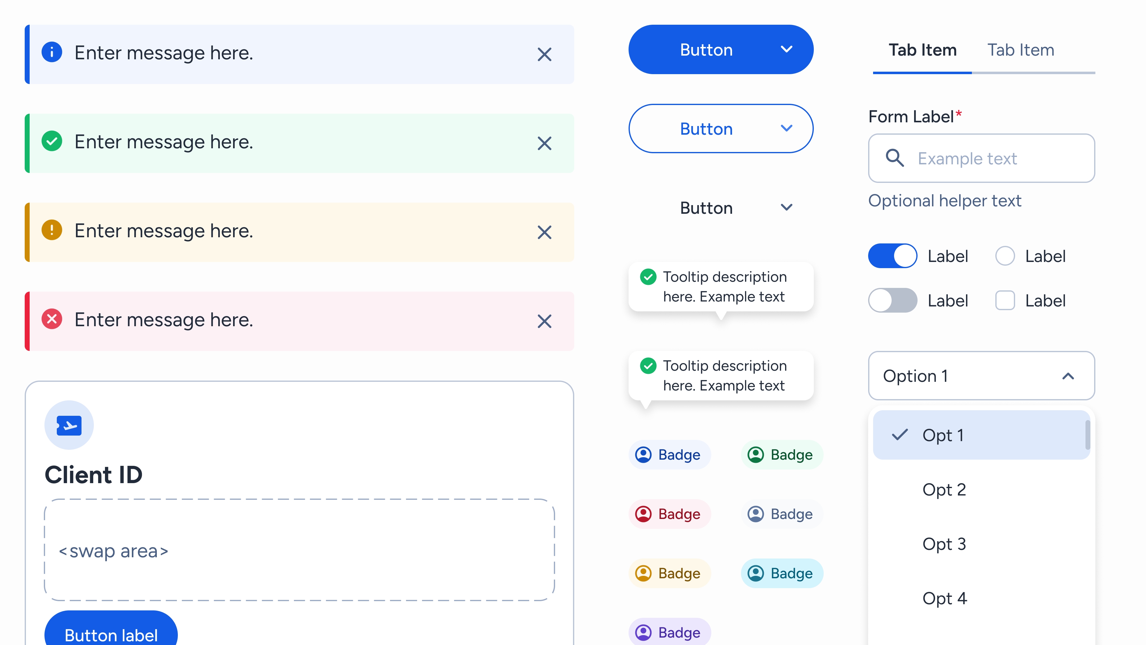
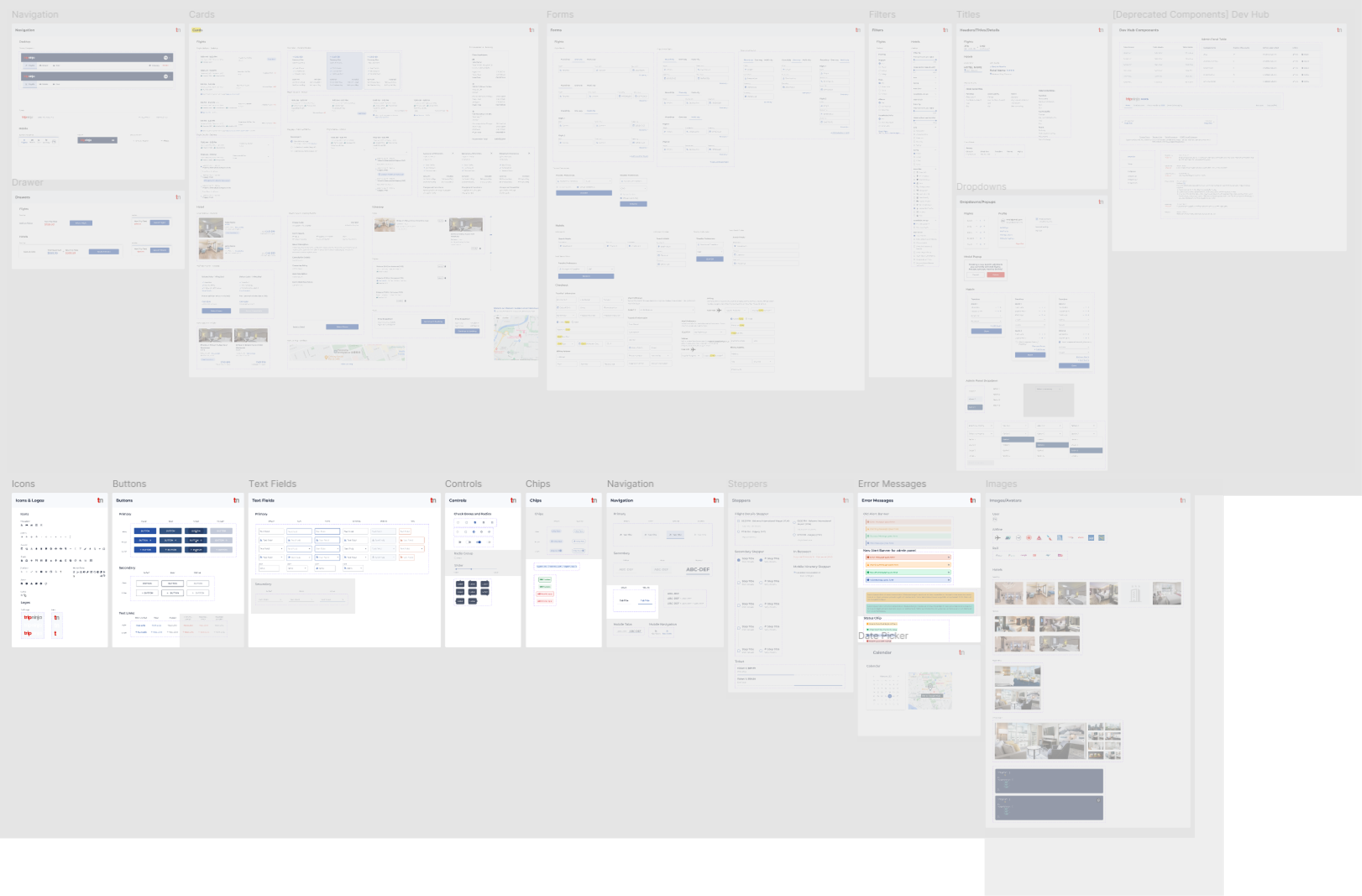
Non-modular components created inconsistencies as the product grew, forcing teams to build one-off variants that duplicated effort and made the library unscalable
After:
Implemented atomic design to build reusable, modular components that can be easily maintained and modified for multi-functional uses.
Before:
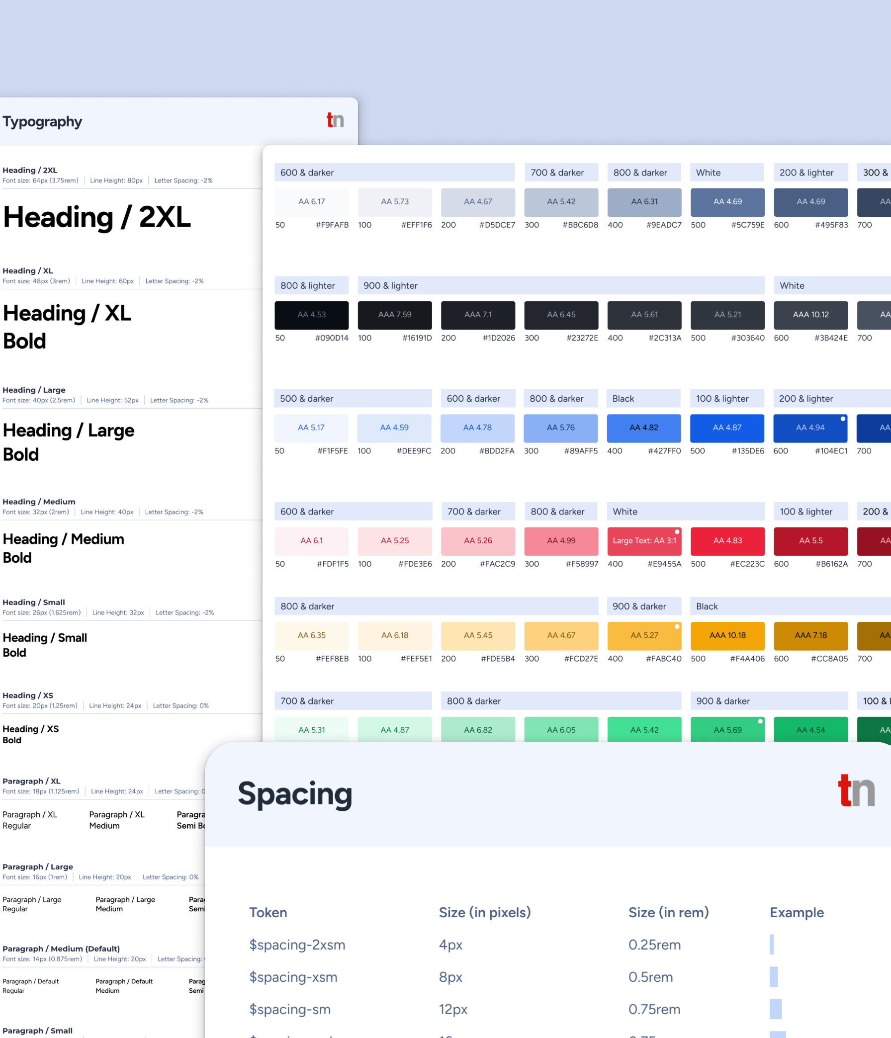
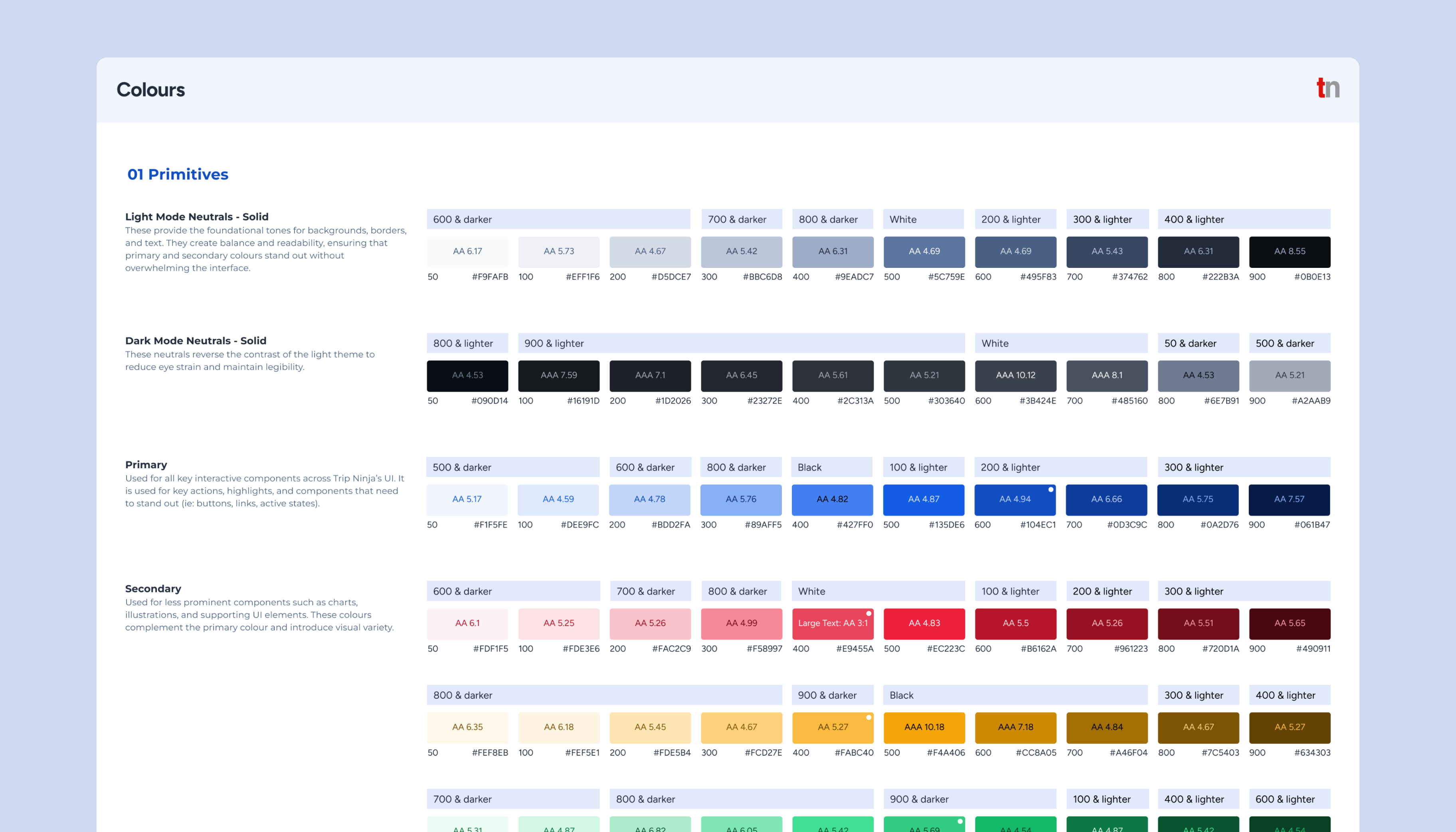
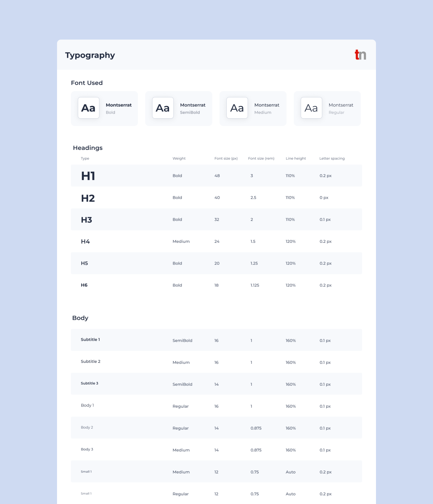
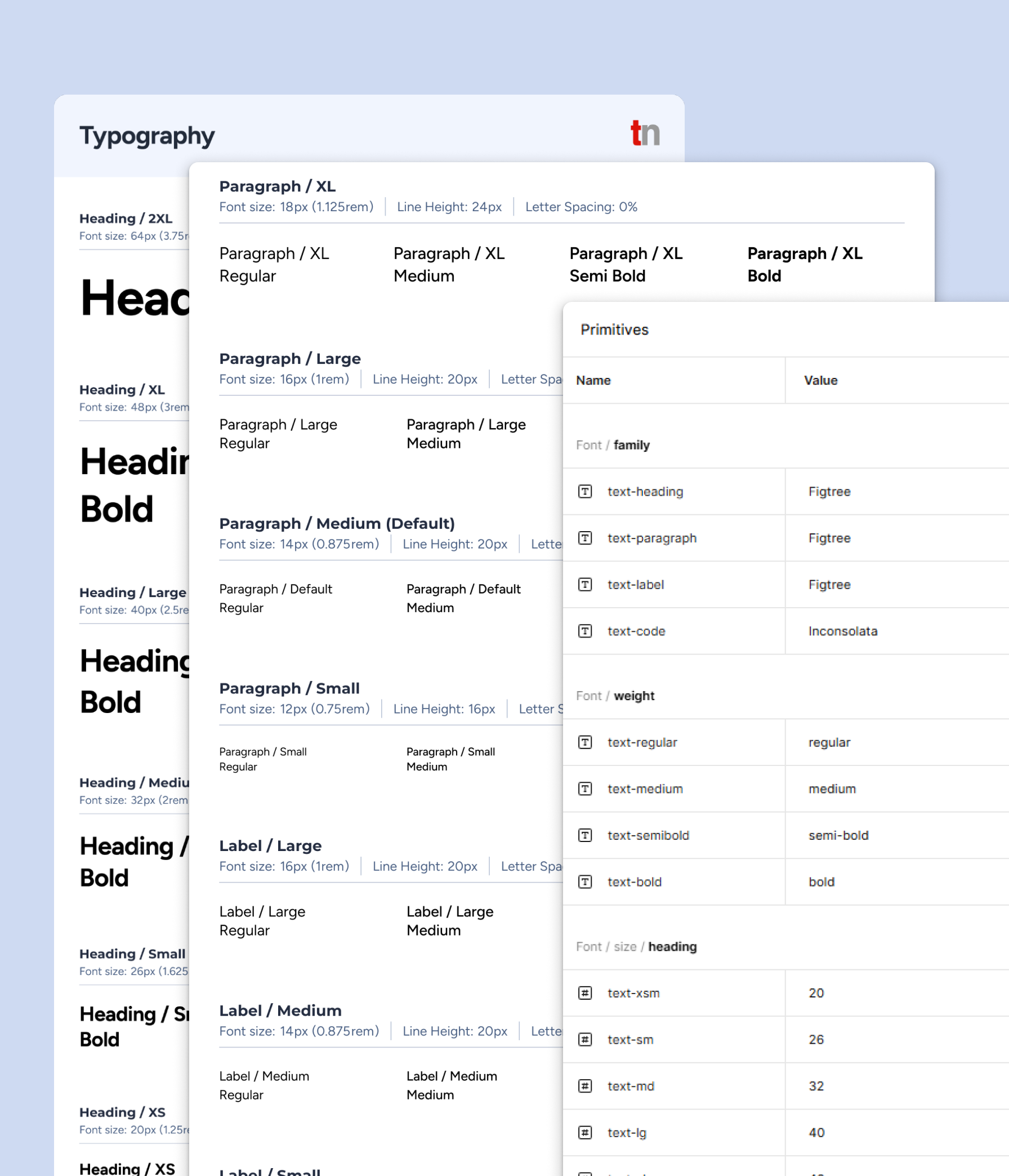
Limited colour palette and typography scales defined, and inconsistent usage of spacing impacted styling of components which created visual debt and unclear UX patterns.
After:
Defined tonal colour ramps, scalable typography, and spacing system to create visual hierarchy without bloating the system.
Before:
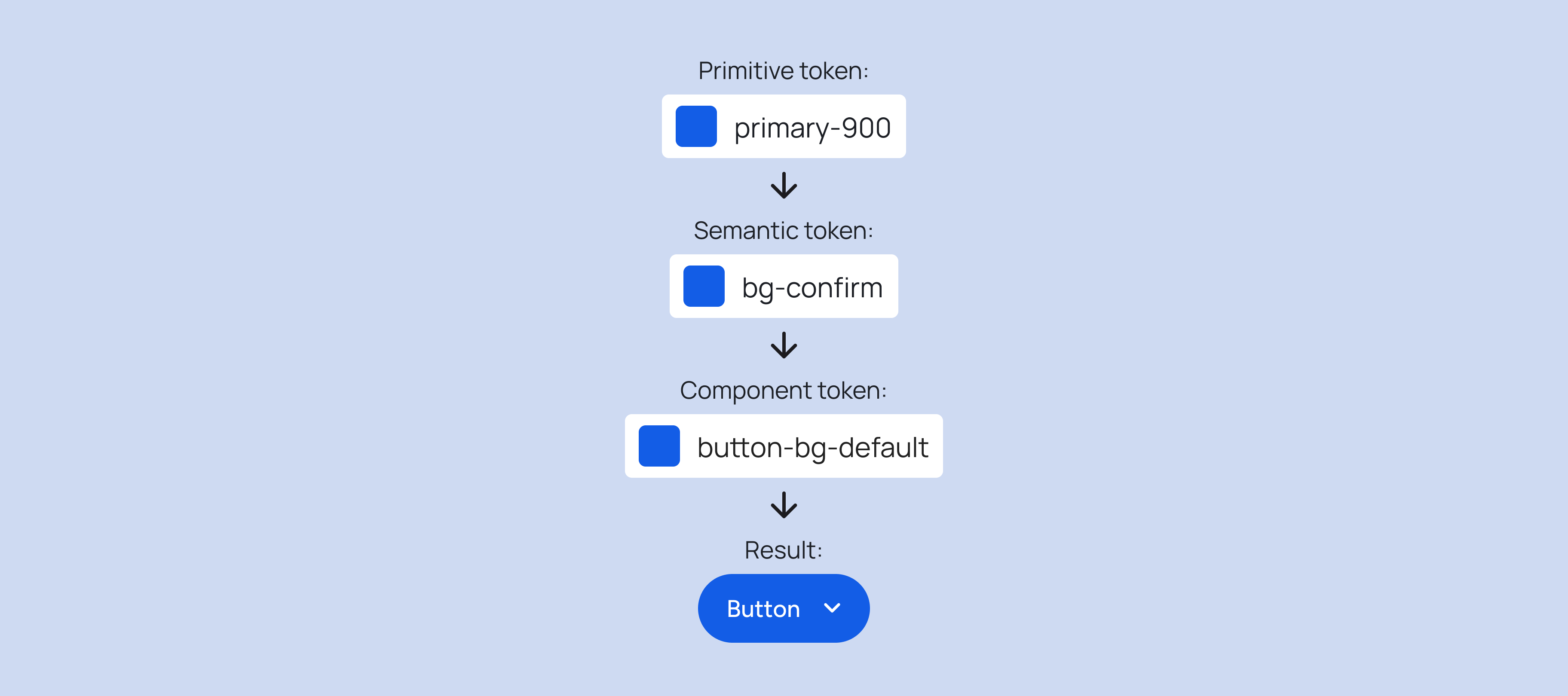
No design token architecture existed, so teams hardcoded values like colours, spacing, and typography across Figma files and code. This created inconsistencies between designs and implementations, with duplicated work and constant debates over "the right blue" or "standard padding".
After:
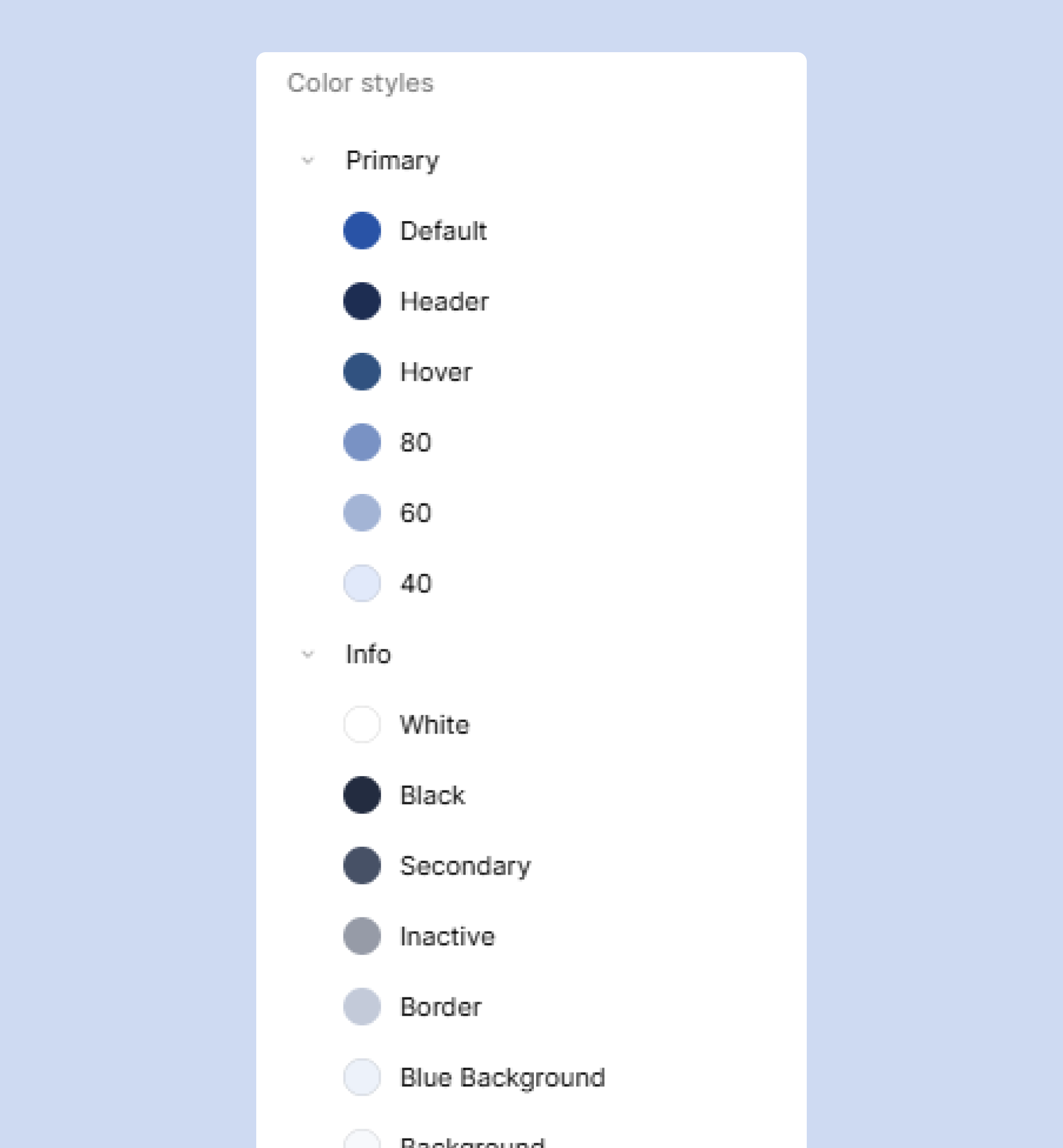
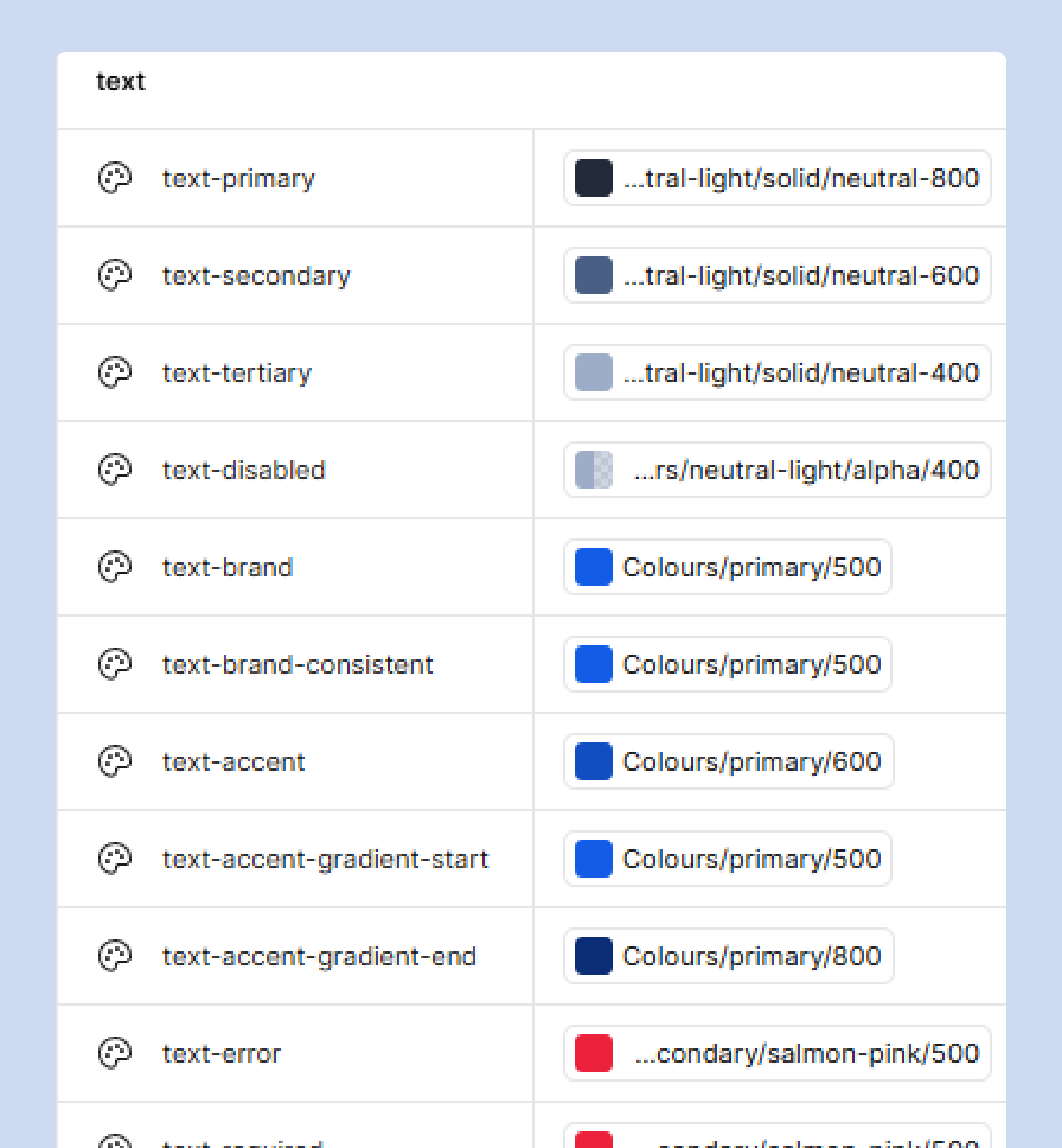
Established a design token architecture that is named consistently and used across Figma and code. Teams now reference semantic tokens (ie: colour-primary, spacing-medium) across tools, building shared understanding, eliminating guesswork, and reducing redundancy in both design and development.
Before:
Documentation was minimal, which left teams unclear on when or how to use components during handoffs and discussions.
After:
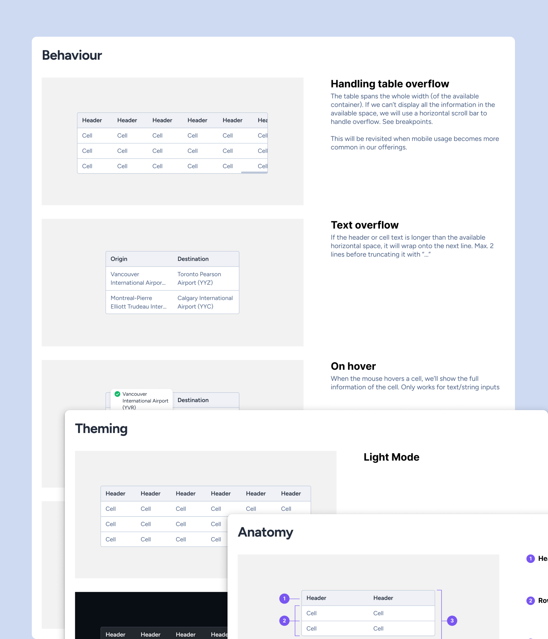
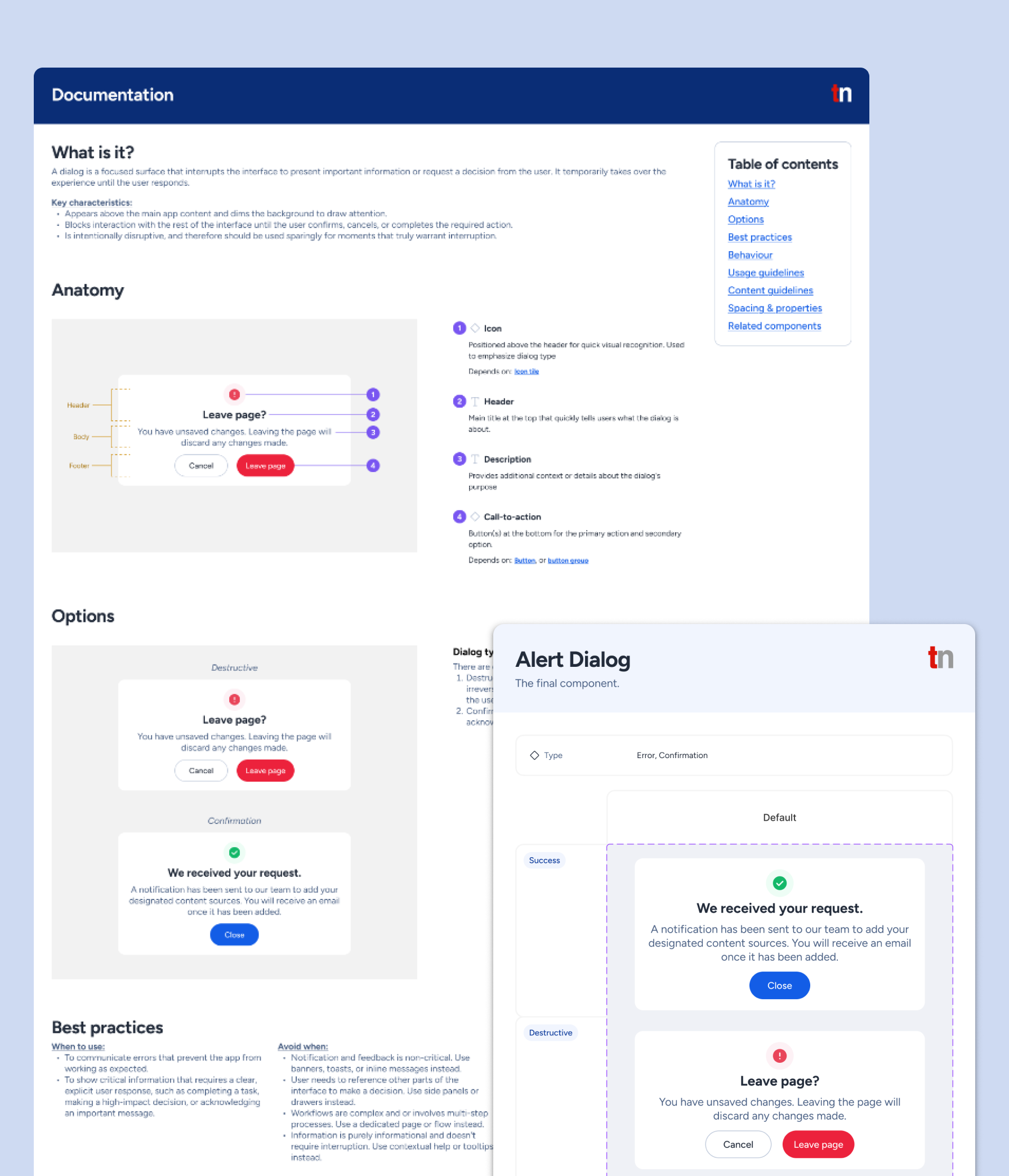
Consolidated comprehensive documentation with usage rules, behaviours, anatomy, and guidelines to establish a clear, shared understanding across teams
I audited the design system to understand how it was used in the admin panel and discovered that only around 20% of components were actively used despite the design system’s size. Within that subset, one-off variants were built, creating visual inconsistencies, duplicated work, and maintenance overhead that increased design, development, and QA efforts.
The following insights were surfaced during informal discussions about the design system with engineers and project managers:
These insights shifted my approach from incremental fixes to rebuilding the design system from ground up.
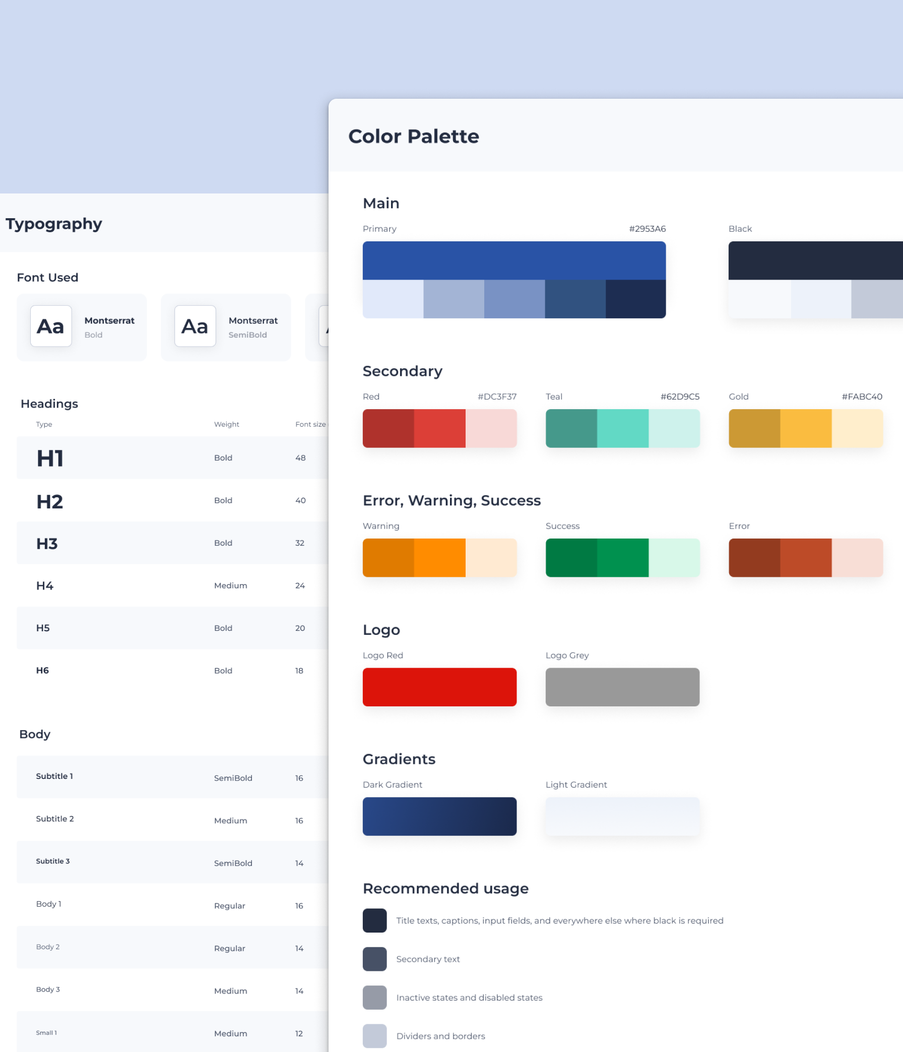
I conducted a brand perception survey to better understand how the company was being viewed internally, and the results showed that the visual identity felt dated and no longer reflected the direction we wanted to take. That insight informed a refresh of the design system foundations, including colour, typography, and imagery, so the product could feel more aligned with the company’s evolving brand perception.
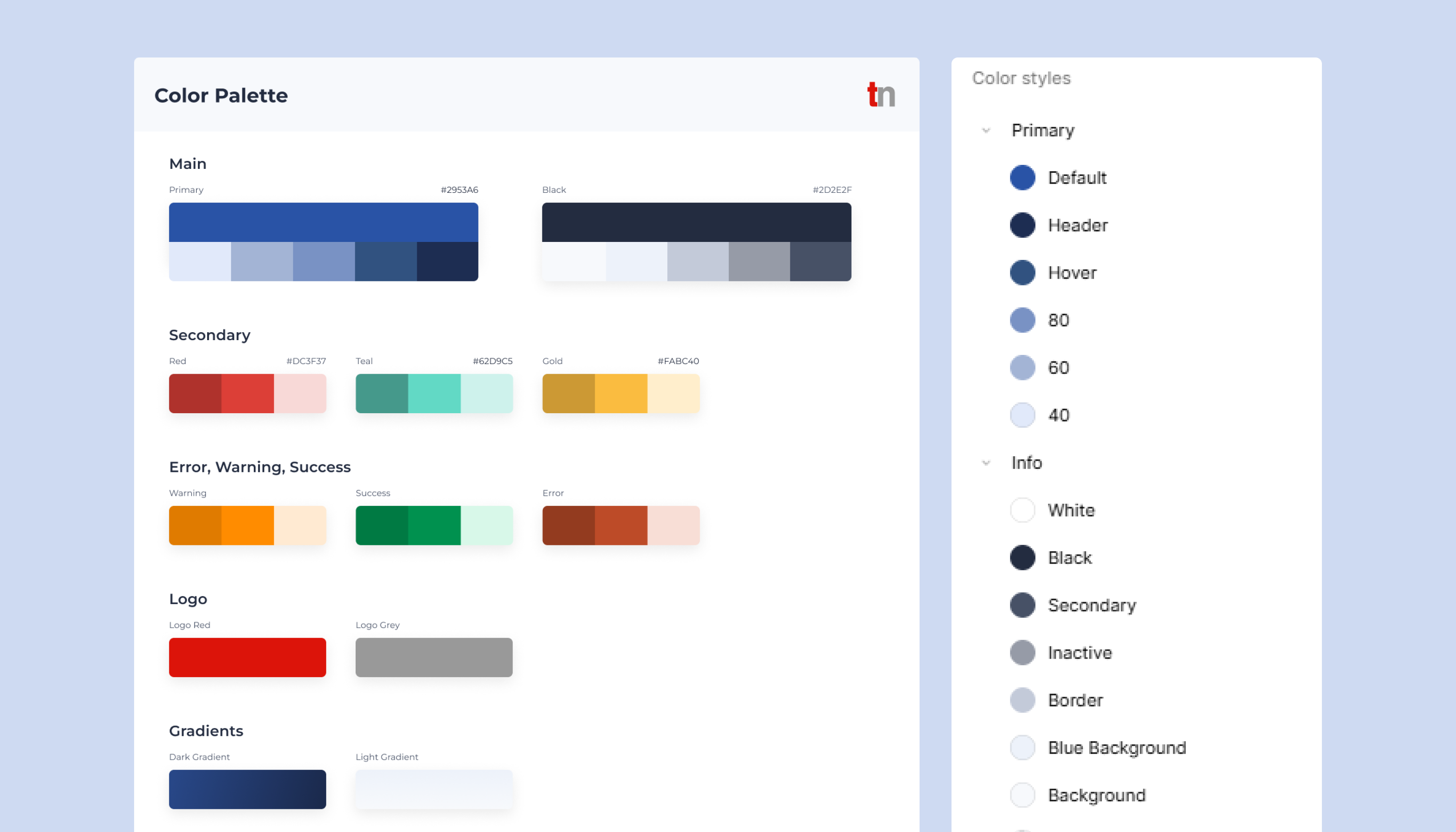
I introduced a fresher colour palette to modernize the interface and support accessibility, expanded typography to improve hierarchy and flexibility across the UI, and refined imagery to feel more consistent with the updated tone of the brand.
I also expanded the font weights in our typography to give more options during designing to create clear information hierarchy as the previous system offered two font weights that led to ad hoc styles and introduced inconsistency across the UI.
Before:
After:
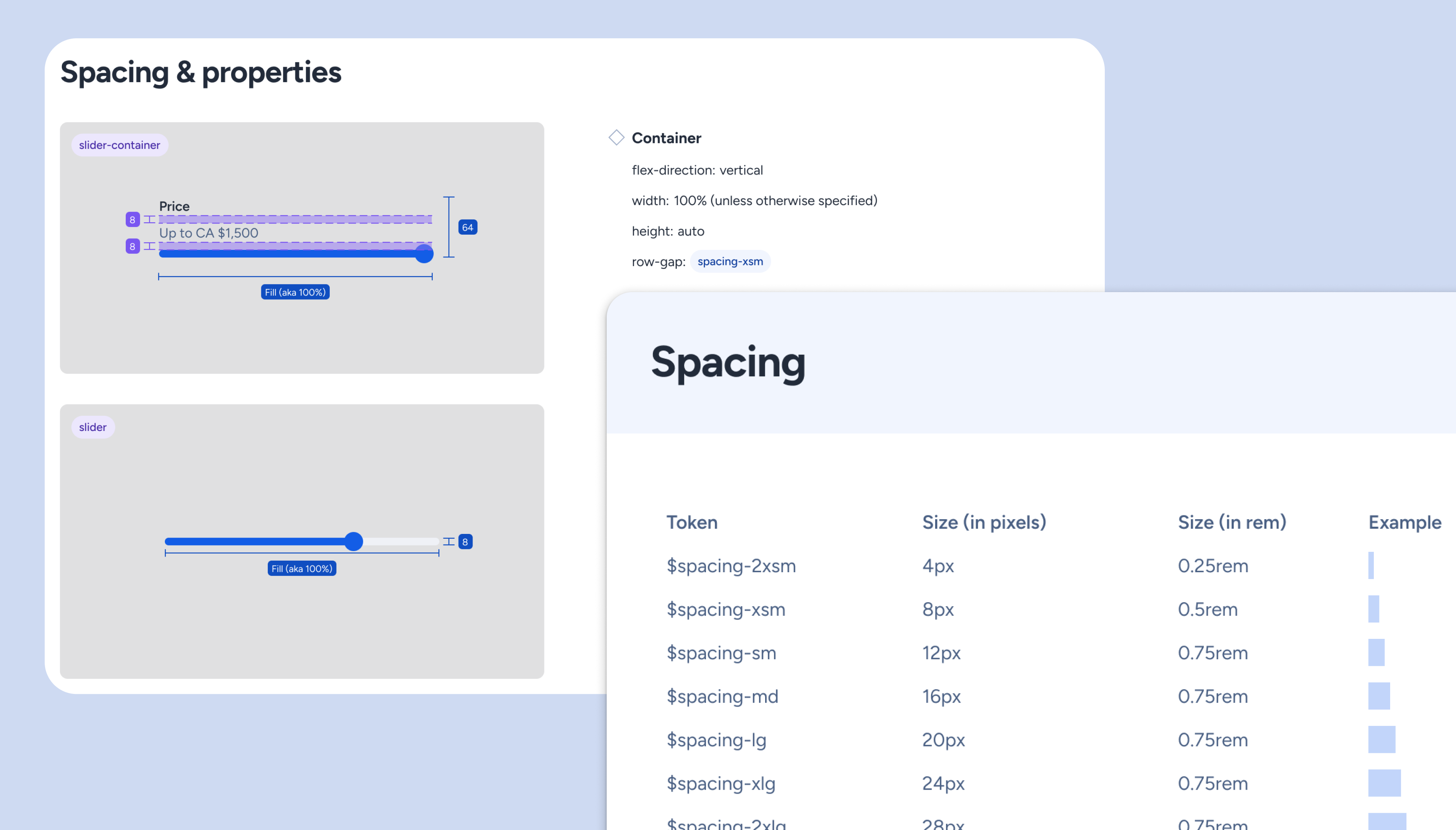
To address layout issues, I also defined a 4px spacing scale (chosen over the common 8px grid for finer granularity and control), along with grid, radius, and elevation foundations. The lack of a spacing system had previously led to uneven component heights and visually unbalanced interfaces, so these additions helped establish a more predictable structure across the product.
Hard-coded values made making changes more costly as it required more effort and time. We needed a structure that would scale and is easily maintainable. With my lead, I introduced design tokens that acted as a deliberate bridge between design intent and code implementation, supporting multiple token types such as colour, spacing, and typography.
Since I hadn’t worked on a design system at this scale before, my process started with targeted research. I leveraged prior coursework, medium articles, and attended a design workshop on design tokens, then iterated naming conventions with the engineers through trial and error to ensure naming is intuitive for both designers and engineers.
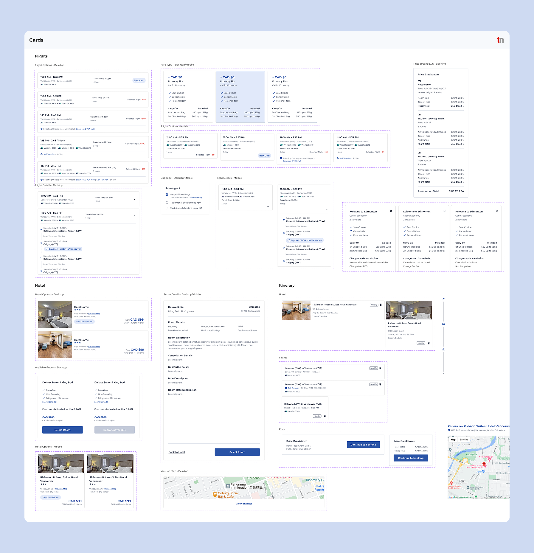
I worked with the lead engineer to identify and simplify components that served identical purposes but were named differently. Once we had a better understanding of what components were needed, we tackled the issue of detaching components on Figma, since FIgma-to-code alignment was important in building product features accurately and quickly. The existing components were too rigid to support future use cases, so I broke them down into their smallest parts and rebuilt them atomically. Atomic structure was chosen to support reusable and scalable construction, allowing changes to cascade more predictably, and gave engineers a clearer path for implementation.
Designing from the smallest reusable unit also reduced duplication and made it easier to compose more complex components without creating new variants for every edge case.
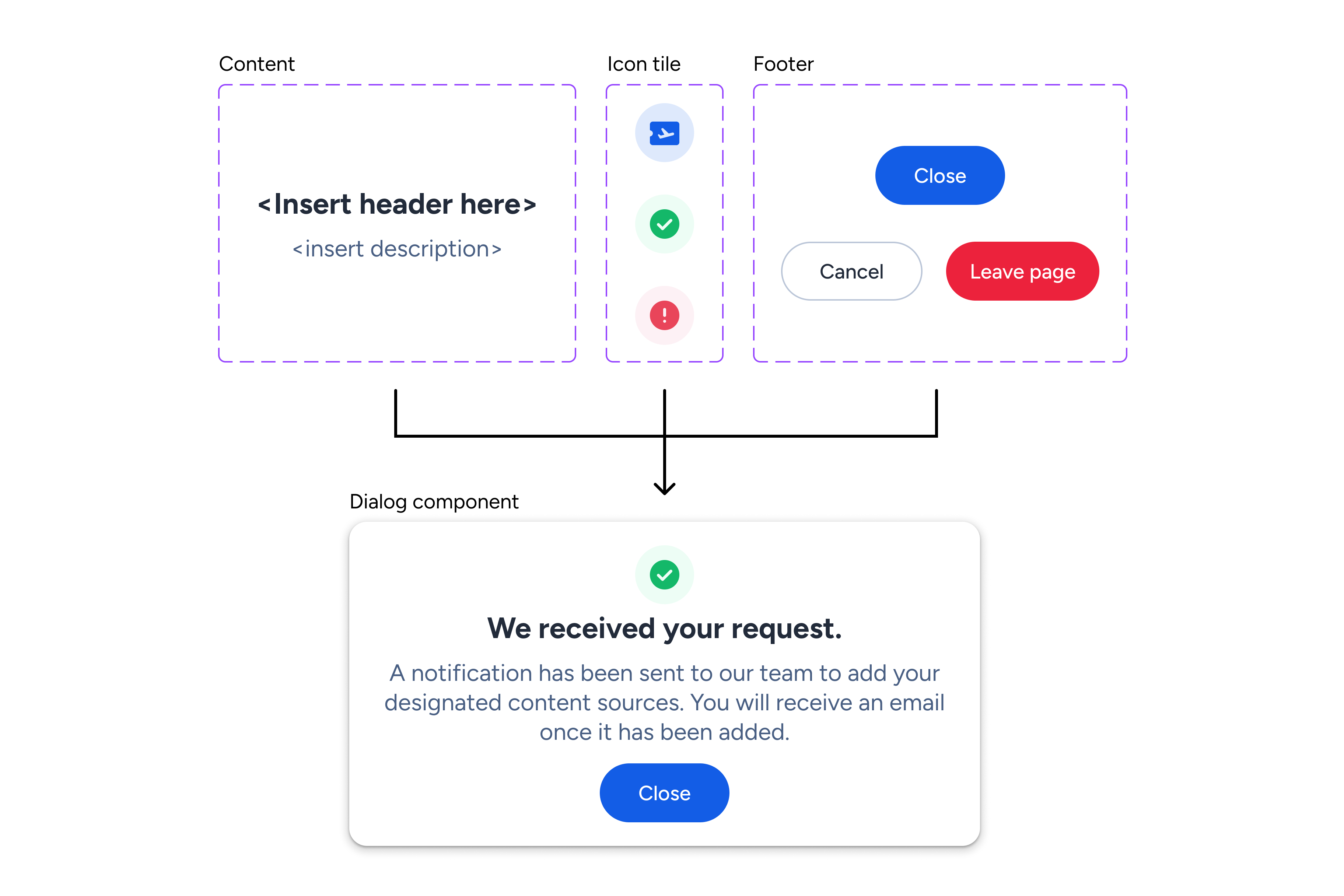
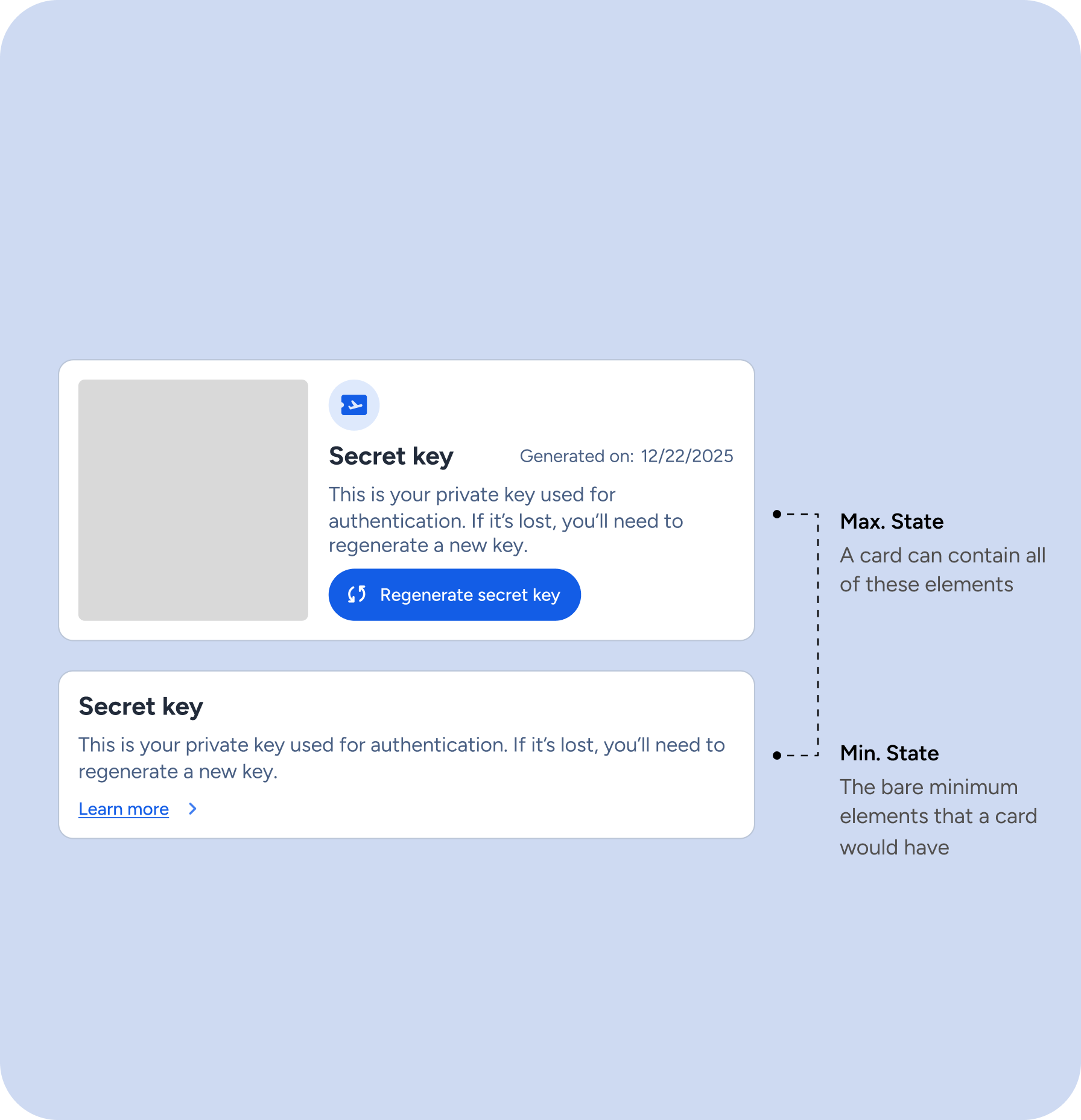
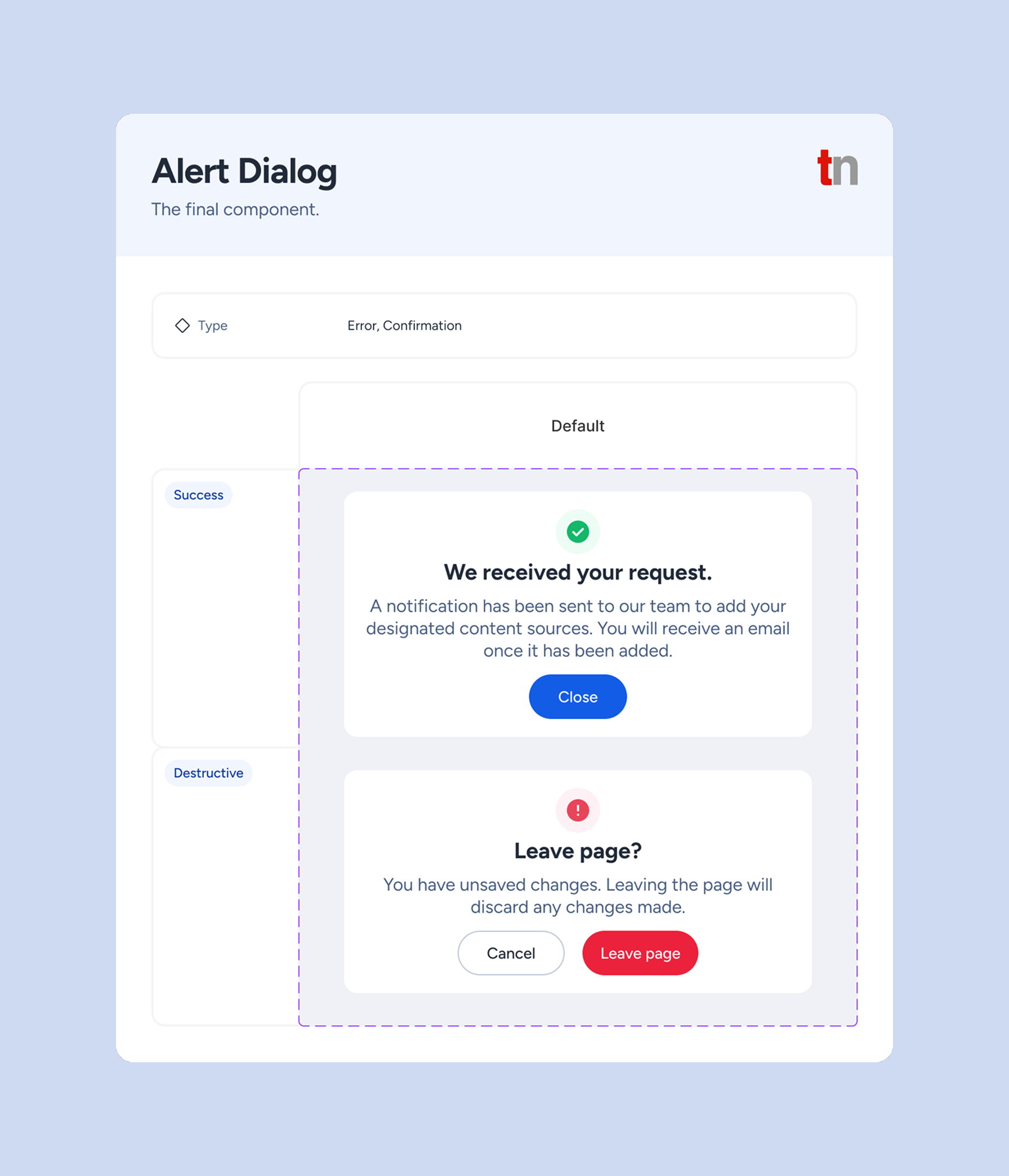
I initially documented only the component state, but weekly design reviews and QA revealed broader gaps in understanding. Teams needed more than visual definitions - they needed clarity on usage, behaviour, content rules, and anatomy to make implementation decisions confidently. In response, I expanded each component’s documentation gradually over time to create a shared reference point and reduce interpretation gaps for design, development, and QA.
Before:
After:
As the sole designer working between higher-priority projects, I felt behind the pace of three dedicated engineers building components rapidly during sprints. While they pushed out code quickly, I needed time to establish scalable foundations and Figma components first, creating a workflow gap.
We shifted to parallel design/development workflows, where I ran weekly design sessions to demo progress, gather engineer feedback early, and iterate before components were finalized. This kept everyone aligned, prevented premature implementation, and ensured the system stayed cohesive as we marked items complete together.
As the project is still ongoing, we have not yet seen long-term results. However, there are some instant wins:
Smoother hand-off, implementation, and QA
Clearer documentation and handoff processes meant less back-and-forth with developers, fewer QA bugs overall, easier tracking of visual and accessibility problems, and much faster QA signoffs. Design and dev finally had shared standards to work from, so handoffs just took less time.
Less time recreating, and more time designing
The new design system freed up time that was previously lost to rework, letting us polish the visuals and microinteractions that used to be difficult to do.
Team finally speaking the same language
The front-end team responded positively to the direction of the system. There was less guesswork and more “oh, that makes sense” moments around how things should work.
This project reinforced the importance of involving the team early in the process. A design system is strongest when it is built collaboratively, not in isolation - but this is true for other design work too! It also showed me the value of regularly checking in and refining the process as the system grows. Design systems are living products, so they need ongoing communication, iteration, and alignment to stay useful over time.